← All work UX research · Animotive

Research as a team of one

Role
Sole UX researcher
Timeline
2020 – 2026
Methods
Surveys, competitive benchmarking, interviews, usability studies, user journey mapping, affinity workshops, heuristic evaluation
Audience
Management, engineering, sales
Competitive benchmarking · example entries

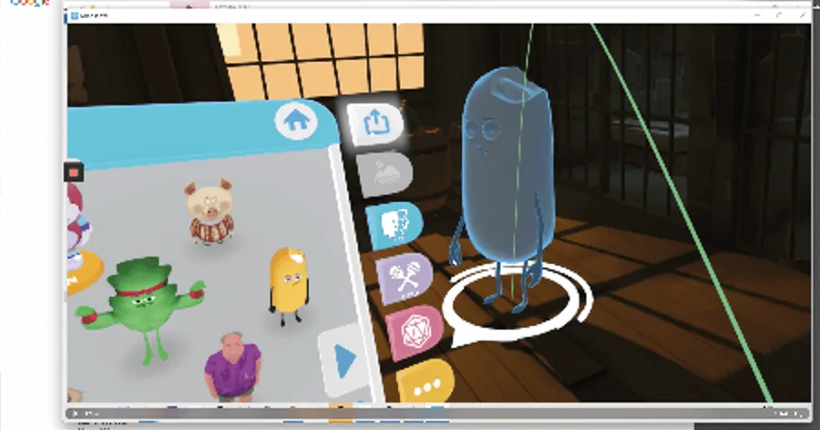
Menu panel (3D object)

Interactions: button push, grab and select.

GoodAffordance on buttons (push-down feedback). All assets and utilities are concentrated in one entity. Easy to grab, with good affordance through side handles, which are overlaid in green when highlighted.

BadDifficult to orient. Objects on the tray are hard to select because they overlap, and the wrong object is often grabbed. Taxonomy is confusing: several buttons contain characters, others, props. Some do not respond. Badly laid out. No tooltips directly above icons.

A third-party VR application's menu panel: a tray of characters beside a column of tool buttons.

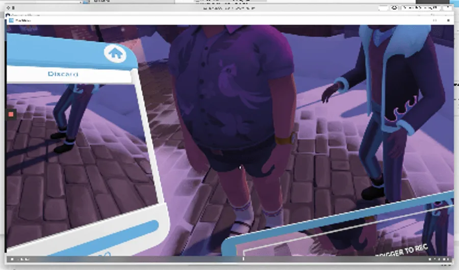
Calibration

BadThe button on the underside of the console is hard to access and rotates the character mirror, which is very awkward and disorienting. No validation feedback on completion. The progress bar is barely visible.

A third-party VR application during calibration: a character mirror seen from below, with a panel at the edge.
01 A competitive benchmarking report across 17 VR applications. Two entries shown.

Context

Animotive is a small company building a complex professional product. We needed to build on evidence rather than assumption, so research had to be part of every phase of development.

Right-sizing the method

With a team of one, the craft is choosing the cheapest method that answers the question.
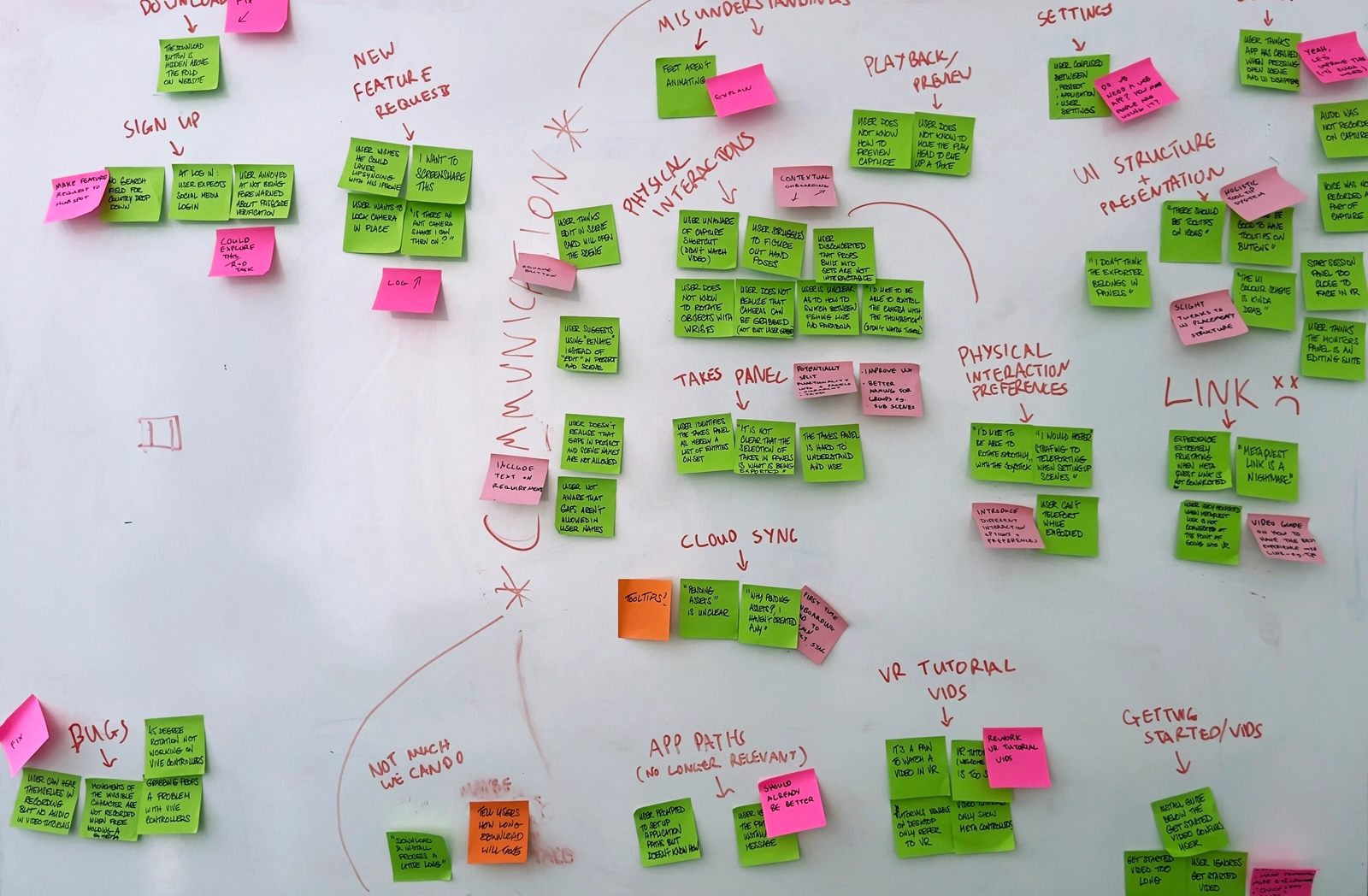
A whiteboard covered in coloured sticky notes grouped by theme, from a team affinity workshop.
02 An affinity wall from a team workshop, grouping findings by theme.

One study, end to end

Participants were recruited against a validated persona from professional studios and certified training centres. Sessions ran over a week; findings were analysed, written up and shared within three days.
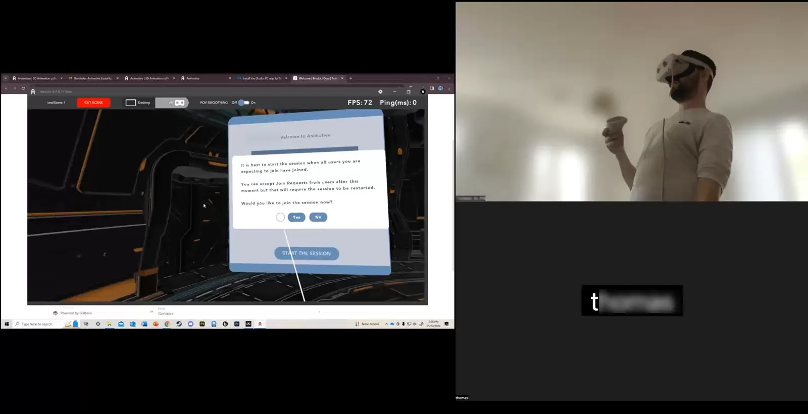
A usability session: a recording of the application on the left and the participant wearing a headset on the right.
03 A usability session, with the participant in the headset beside the captured view.

Making findings land

I reported at three levels:

  1. Stakeholder document. Every issue, categorised and ranked by the task-completion scores from the journey map.
  2. Fast feedback report. What worked, what didn't, and how to close the gaps in the user journey.
  3. Executive summary. The results of the sessions and my recommendations.

What I learned

Define the issue and the goal first, and a small, targeted sample is usually enough. Measure each change in the next version. Keep designer, head of development and product owner talking throughout, so iterations stay quick.

Next case study A design system built with engineering →