← All work Spatial UI · Animotive

Designing UI for virtual reality

Role
Sole UX/UI designer & researcher
Timeline
2020 – 2026
Team
PM, engineers, QA engineer, marketing, sales
Tools
Figma, Blender, Unity hand-off, AI tooling
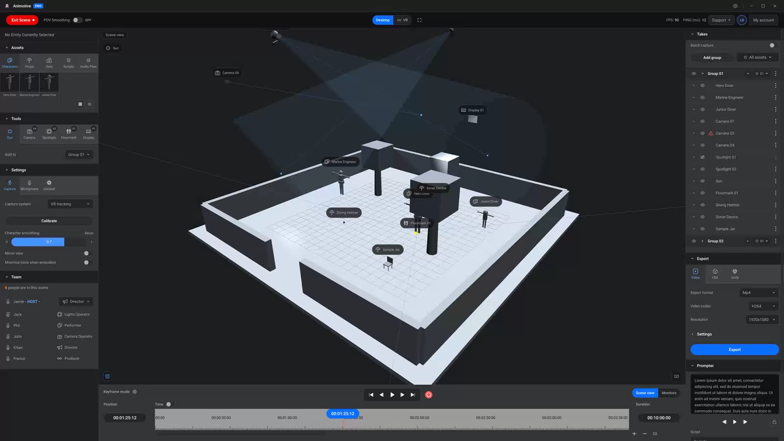
Animotive desktop application: a 3D viewport with a staged scene, asset panels on the left, a take list on the right and a timeline below.
01 The current state of the Animotive interface. The whole application was rebuilt in Claude as an advanced interactive prototype, to explore a reconfigured information architecture as well as an improved user experience.

Context

Animotive lets film and animation professionals perform, direct and edit 3D animation in virtual reality. Its users are experts in their craft, not necessarily in VR. My job was to make a deep, professional toolset feel immediate inside a headset.

VR removes the usual assumptions. There is no precise cursor and no keyboard within reach, and few conventions are settled, so I benchmarked other applications to establish good practice. Legibility, arm fatigue and comfort become primary constraints, and every pattern had to be tested wearing the headset.

Animotive is a small company in a young market. I owned usability and design quality, not sales, and this page shows what I can evidence.
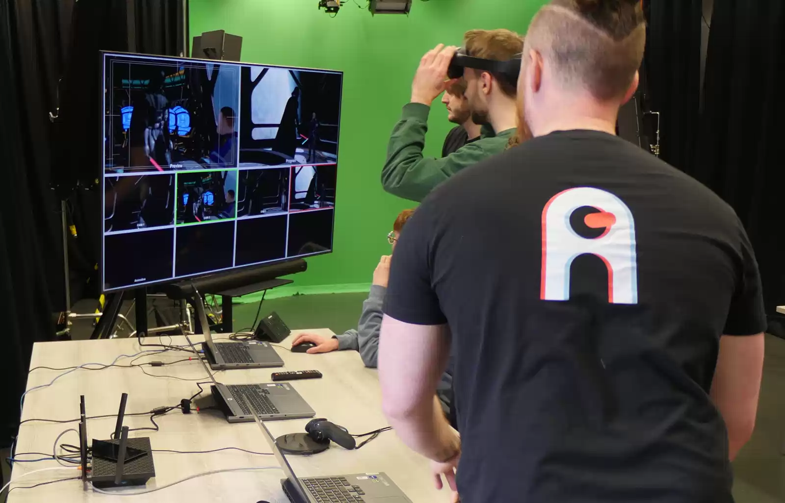
Colleagues in Animotive T-shirts watching a multi-view screen at a workshop.
02 Colleagues and students at an Animotive workshop, reviewing a session on a multi-view screen.

The challenges

1. Reach, comfort and panel placement

Performers need immersion, mobility and comfort. The interface had to respect emerging VR conventions while meeting the demands of a conventional desktop tool, including scheduling and invitations in an embedded web browser.
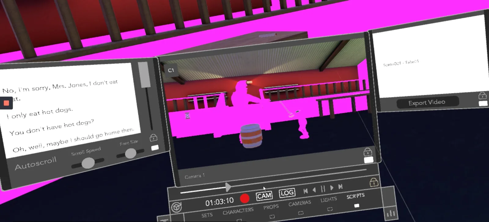
An early build in the headset: a script panel, a camera view and a transport bar floating over the scene.
03 An early iteration: the user's point of view is occluded by the panels.

2. Legibility and information density

Building and debugging the UI inside the game engine, the developers set out their constraints and we agreed a method for design hand-over.
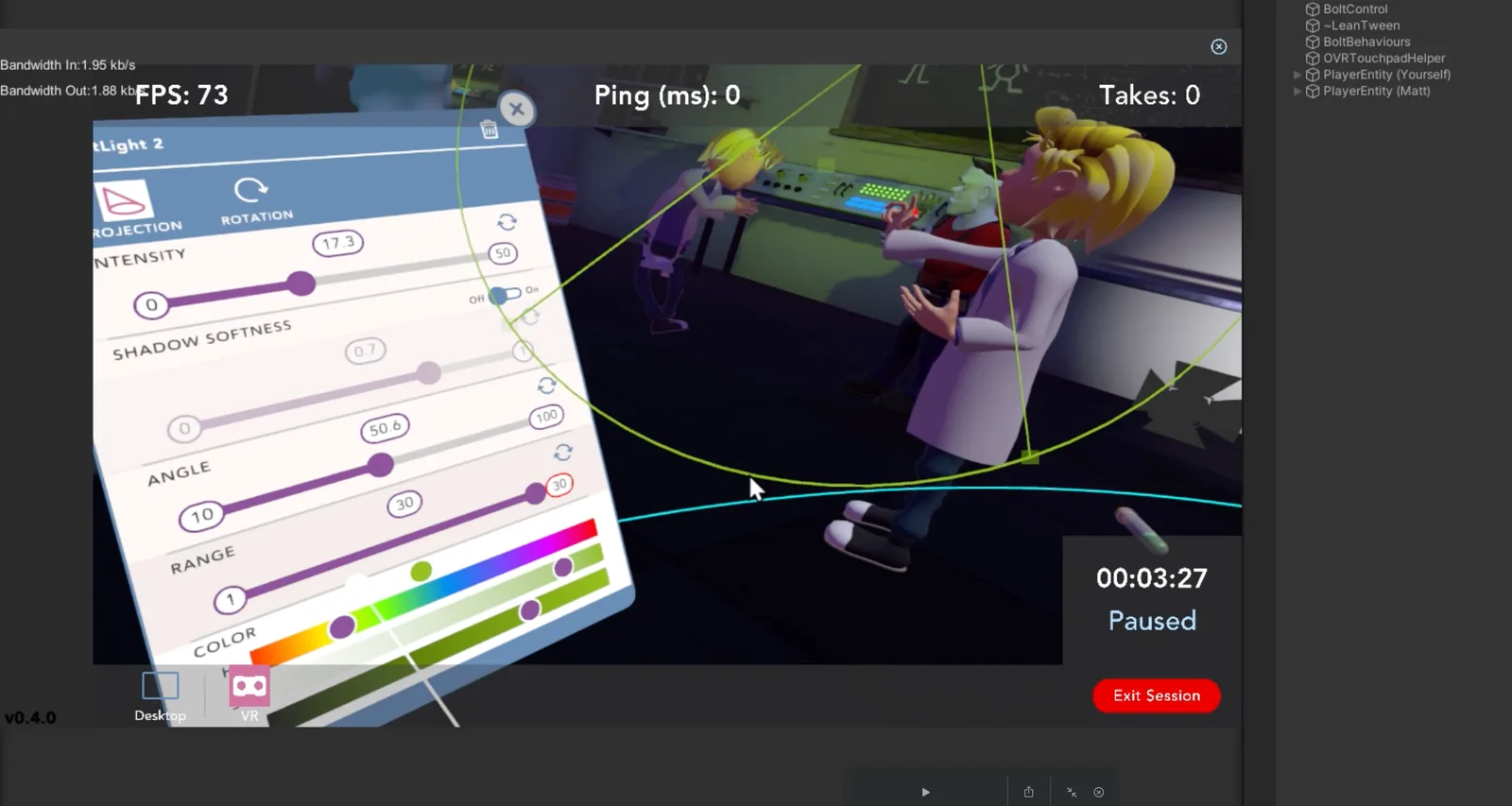
The Unity editor: the Game view shows a lighting panel with sliders over an animated character, with the console alongside.
03 Debugging the UI in the Unity editor.

3. Interaction without conventions

Each build and test round improved the interface, and some features disappeared when they were absorbed into others.
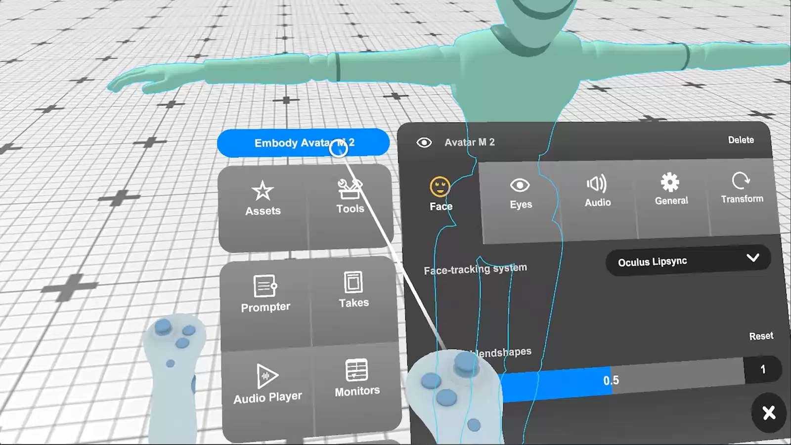
The in-headset menu for embodying a character: Assets, Tools, Prompter, Takes, Audio player and Monitors beside the avatar panel with face-tracking options.
04 Embodying a character: the main menu and avatar panel in the headset.

How it was validated

Every significant pattern was tested in the headset with working animators, with remote studies and surveys for wider signals. Findings were ranked by severity and fed into the backlog I shared with the team.
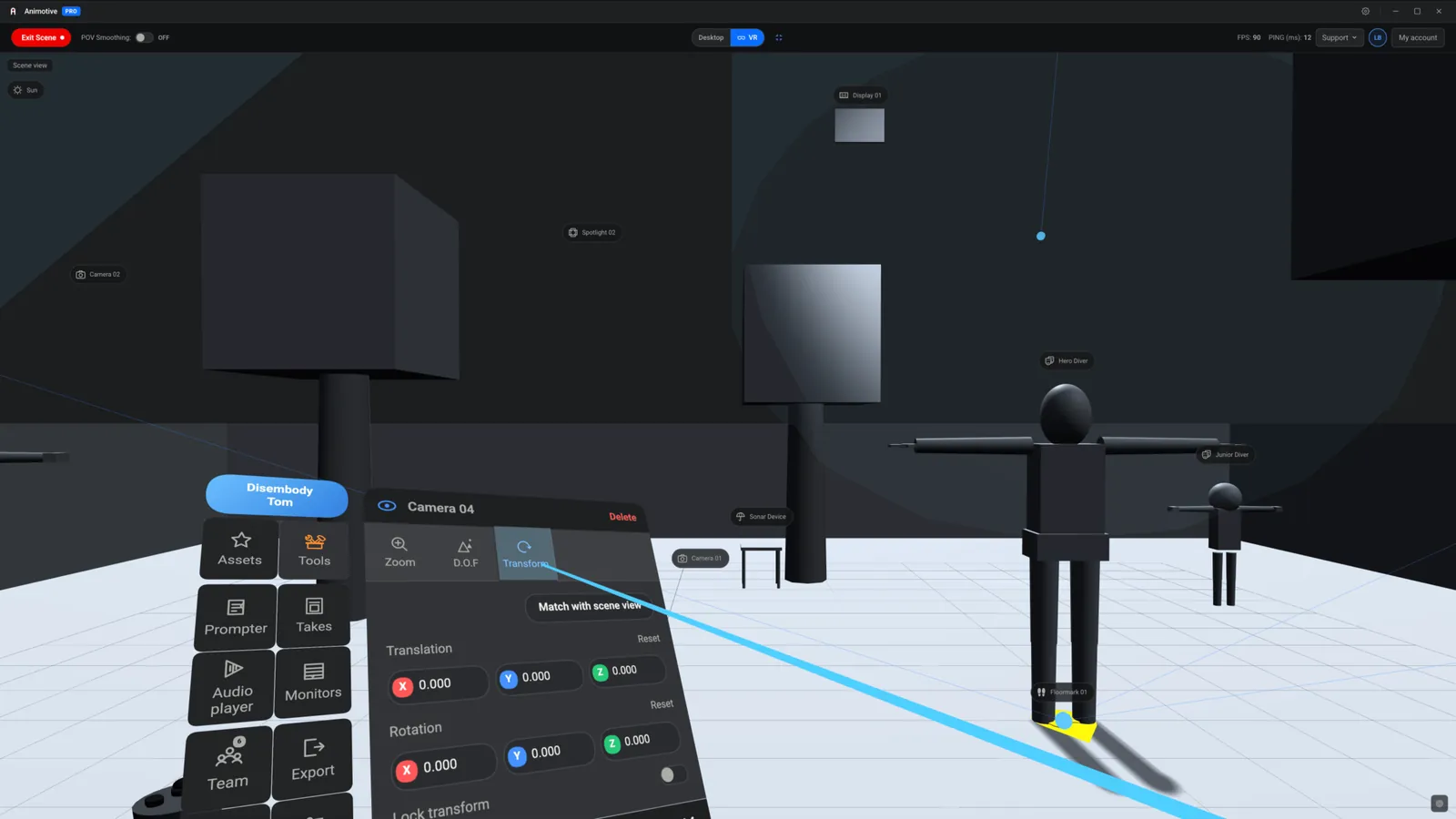
A high-fidelity interactive prototype of the in-headset UI: a floating menu and a camera panel with translation and rotation fields.
05 A high-fidelity interactive prototype built with Claude, so usability and accessibility could be tested early, with a person reviewing the results.

Continuous testing with real users and daily conversation with stakeholders kept the main usability problems moving.

Next case study Research as a team of one →